05.10.02
Typographic Horrors
For the first time, I’ve seen a sign that just made me gasp and gawk. Could it get much worse? It’s one thing for a store’s sign to use the “OCR Extended” font which comes with Windows.
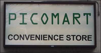
But to then follow it up with Arial in all caps? It’s enough to make my eyes bleed. Look at that weak R or those ugly ‘E’s with their equal length arms. You’d think it was a cheap knock off of Helvetica…